
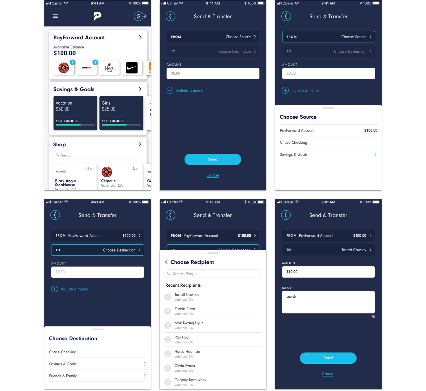
One of the first problems I saw when redesigning the app was how much confusion the transfer money screen was causing customers. A lot of people were calling in saying they accidentally transferred money from one place to another.
A user would need to find the transfer button in the wallet and then choose from several buttons with iconography and instructions in order to transfer money. In many cases, iconography can be helpful. But in this case, it’s a distraction that causes even more cognitive load and makes the user have to read and match the words to the icons before figuring out what to tap.
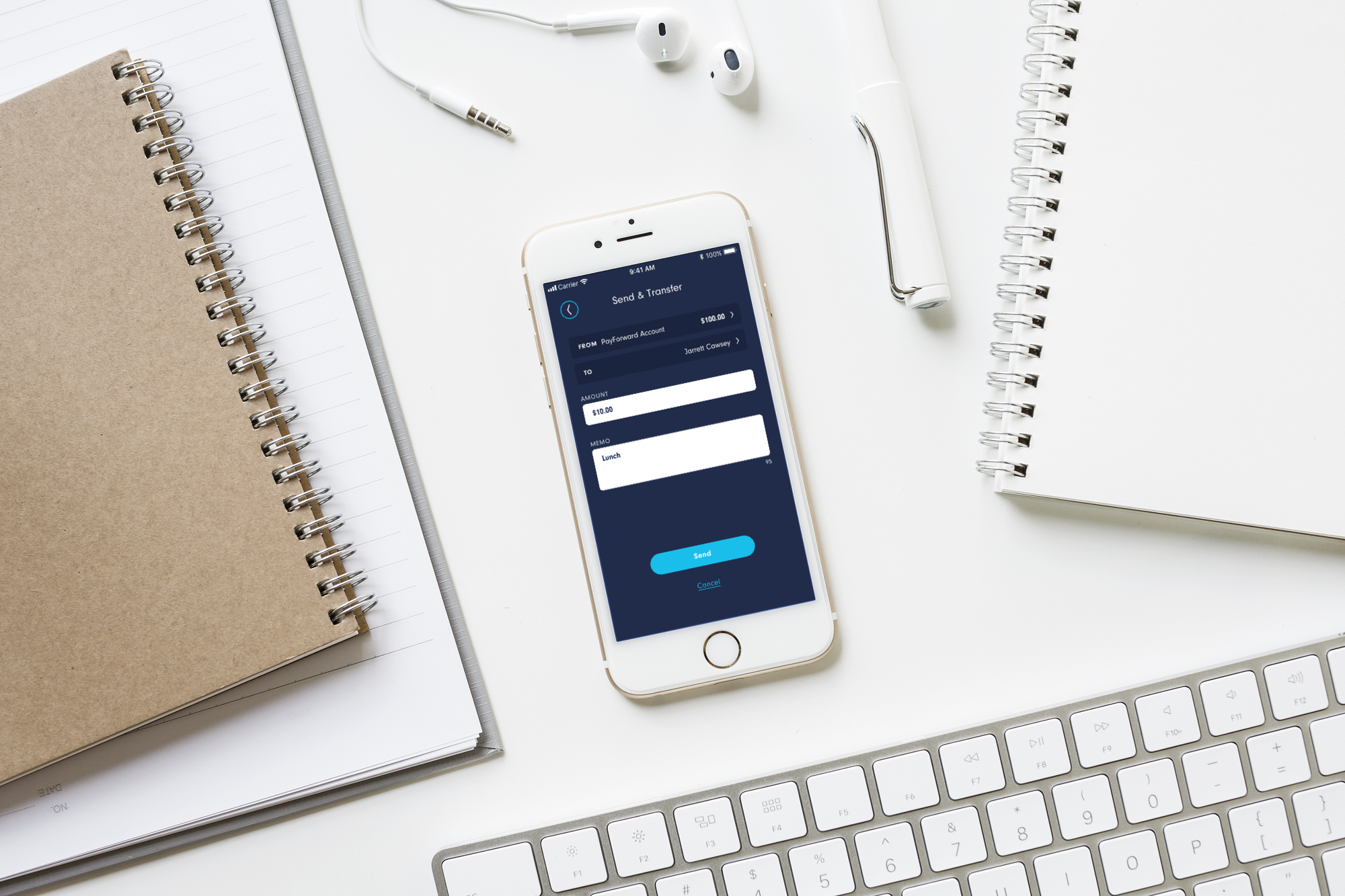
The new transfer screen creates a natural flow for the user. They can easily navigate to the screen from anywhere in the app. Then, all they have to do is choose the source of the payment, where it’s going, for how much, and then send.