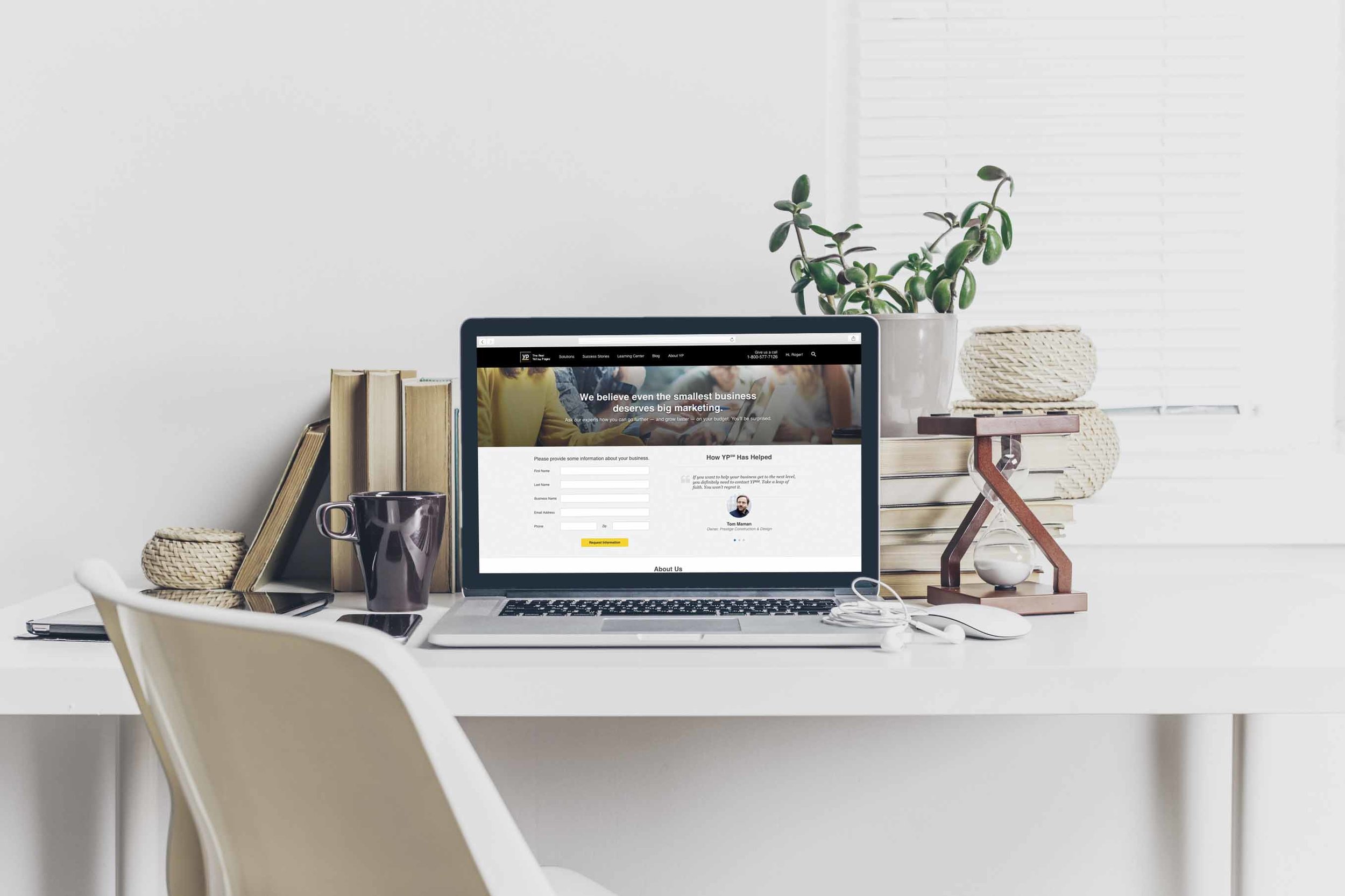

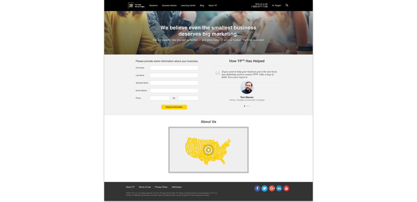

Potential customers were clicking “Learn More” on product pages expecting a quick, helpful follow-up—but instead landed on a dense, form-first page that felt more like a tax document than a warm welcome. The form was long, impersonal, and lacked any kind of supporting content to build trust. My goal was to redesign the experience to feel inviting, credible, and easy to complete—especially on mobile.
The original inquiry page was bland and had too many form fields. One of the requirements of the redesign was to increase the number of testimonials and add a hero image to visually capture the audience. So I needed to find a way to do that without crowding the page.
After adding the hero image, I met with the project manager to find out exactly what data we needed to capture to simplify the form. I was able to cut down the size of the form by only including essential information. And finally, I found a way to increase the number of testimonials without the visual noise by using a carousel.